


Your Membership Site is Overwhelming (Here’s How to Fix It)

I recently started learning to play drums. My drum kit arrived, and with it, a 90-day trial to Drumeo—a platform packed with lessons from world-class drummers. I was buzzing, ready to unleash my inner rock god. But when I logged in, my heart sank a little. I felt like a lost tourist in a giant, confusing city.
The dashboard was a chaotic all-you-can-eat buffet: lessons, challenges, workouts, packs, songs—all staring back at me. What should I do next? Where do I even start? Am I supposed to just… pick something at random? Decision paralysis kicked in, and instead of feeling inspired, I felt… lost. I found myself clicking back and forth, trying to find a "beginner's path". I closed the tab, and immediately went to playing random things on the drums.
Drumeo isn’t alone. I see this problem all the time when auditing membership sites. Creators, with the best intentions, think more choice is better. But in reality, too much choice without guidance makes users disengage. You pour your heart into creating this amazing resource, hit 'publish', and wait. And then… nothing. Or worse, a few signups, followed by a graveyard of abandoned profiles. It's like walking through a ghost town, those tumbleweeds of forgotten dreams rolling past.
Meanwhile, there’s a site that does this brilliantly: Team Treehouse. Their approach? Instead of just throwing a bunch of courses at you, they ask a few simple questions when you sign up:
- What’s your goal?
- Why are you learning this?
- How much time can you commit?
And based on your answers, they put you on a learning path. For example, if you want to learn data analysis or become a data analyst, they'll put you in the Beginning Data Analysis track. You now have a clear roadmap with structured lessons that make sense. No guessing, no decision fatigue—just progress.
And this brings me to one of the most exciting changes in gaming: Microsoft Flight Simulator 2024’s Career Mode.
MSFS 2024’s Career Mode: A Masterclass in Clear Progression
If you’ve played the previous Flight Simulator games, you know they’ve always been a sandbox experience. You could fly anywhere, in any plane, at any time. Sounds great in theory… but a lot of people never really knew what to do.

In MSFS 2024, they fixed that with Career Mode.
- You start with your Private Pilot License.
- From there, you choose your path: planes (left) or helicopters (right).
- Each step builds on the last—progress feels earned and meaningful.
- You can always explore side missions, but the main path keeps you grounded (pun intended).
This is exactly what membership sites should be doing. Instead of throwing users into an open world and hoping they find their way. It’s like handing someone a map of the entire world when they just want to find the best pizza place in town. Overwhelming, right?
So why aren’t more membership sites doing this? Let’s face it, most are operating like Netflix… and failing miserably.
Why the “Netflix” Model Fails Membership Sites (And How to Escape It)
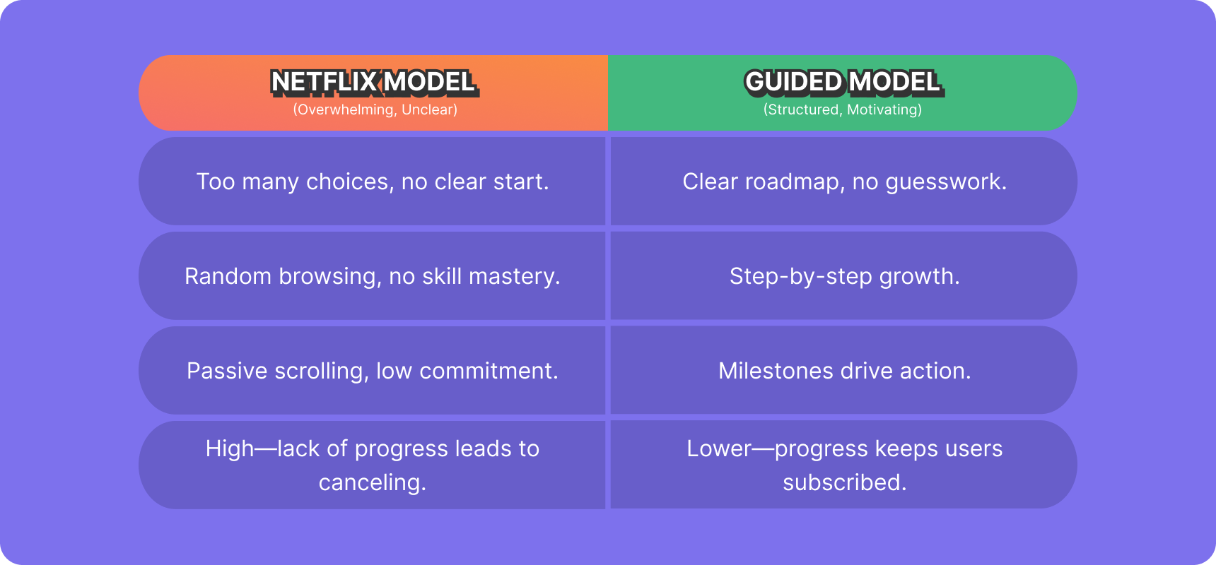
Most membership sites operate like Netflix: they throw a massive content library at users and expect them to figure it out. "Here are 300 courses on everything under the sun! Enjoy!" This leads to six major problems:
- Decision Fatigue – Too many choices make people freeze and do nothing.
- Lack of Progression – Without a structured path, users don’t feel like they’re making progress.
- Low Completion Rates – Courses and lessons get started, but rarely finished.
- Minimal Engagement – Community areas feel like ghost towns because users don’t have a reason to interact.
- High Churn – Users poke around, don’t see results, and cancel.
- Frustration for the Creator – You’ve built an amazing membership, but people aren’t sticking around long enough to see the value.
These are common mistakes I see when auditing membership sites. I've observed that launching courses with excessive content frequently leads to a significant drop in completion rates. It’s like opening a firehose of information when your members just need a refreshing sip.
The “Video Game” Model: A Better Way to Engage Members (No Controllers Required!)
Games—especially well-designed ones—know how to hook players, keep them engaged, and make them feel accomplished. If you want to boost engagement, completion rates, and retention, steal these four game design principles:
- Clear Onboarding: Give Users a “Mission” (And a Damn Good Reason to Accept It)
Great games don’t drop you in blind. They immediately tell you what you’re supposed to do. People crave clarity. They want to know where they're going and why. Giving them a clear mission taps into their desire for purpose.
Think about it: You wouldn’t wander into a dungeon in Zelda without knowing you need to rescue a princess, right? Same principle applies here.
To expand on this, it's crucial to connect the user's goals with the recommended path and the value of each course. When users understand why they are taking a specific course or following a particular path, they are more likely to stay motivated and engaged.
For example, if a user's goal is to become a data analyst, the "Beginning Data Analysis" track should not only provide the necessary skills but also clearly articulate how those skills contribute to achieving the user's goal. Each course within the track should have a clear objective and explain how it helps the user progress toward their goal.
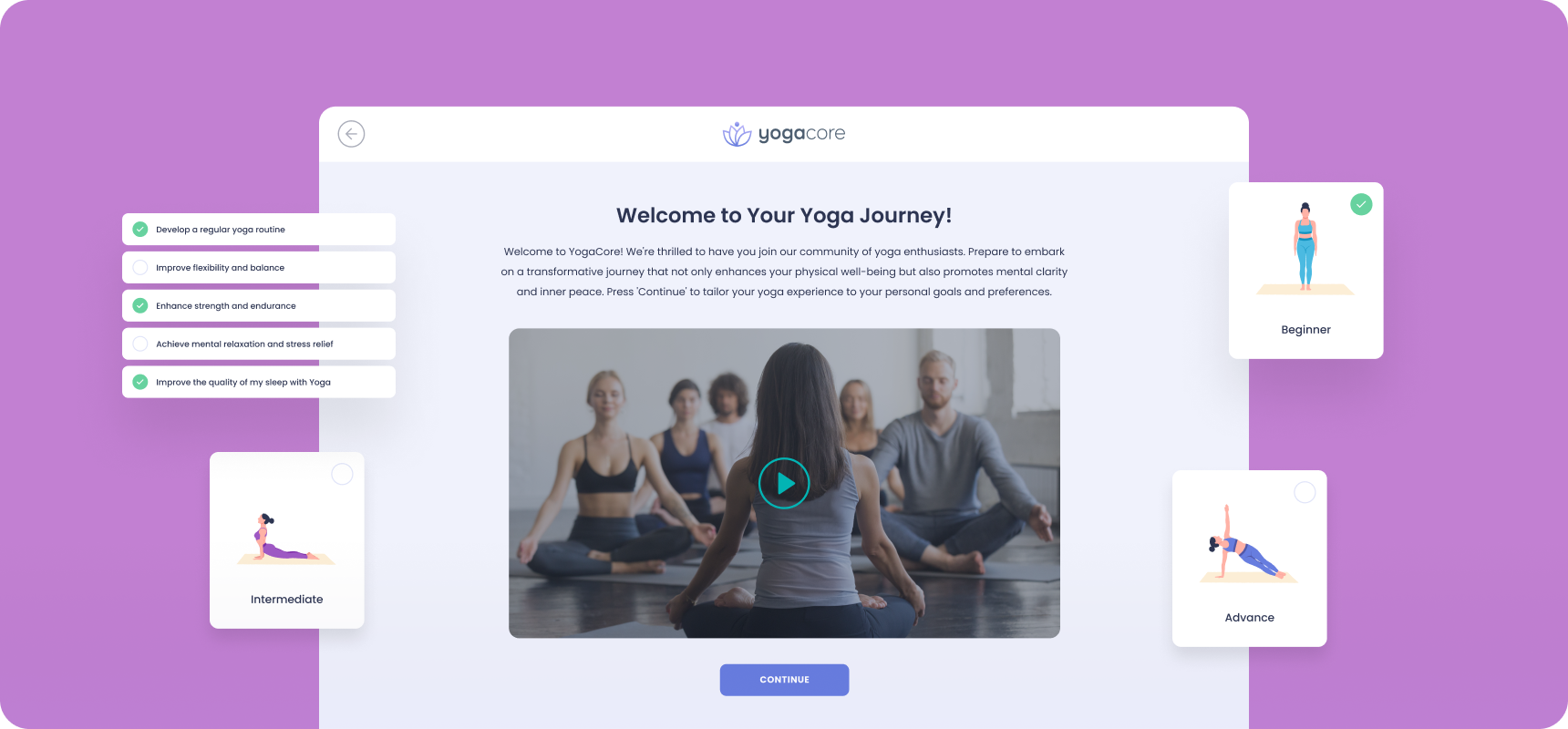
Yoga Core Case Study:
Let's imagine Yoga Core, a fictitious yoga membership site. They’re currently operating like Netflix – dozens of yoga course, videos, resources, meditation sessions, and workshops, but zero guidance. How can they implement clear onboarding?
Here's the step-by-step:
- Goal-Oriented Questions: When a new user signs up, don't just let them loose in the content library. Instead, present them with a simple questionnaire:
- "What's your primary goal for joining Yoga Core?" (e.g., Reduce stress, Increase flexibility, Build strength, Improve sleep, Lose weight)
- "What's your current experience level with yoga?" (e.g., Beginner, Intermediate, Advanced)
- "How much time can you commit to yoga each week?" (e.g., 30 minutes, 1 hour, 2+ hours)
- Personalized Learning Paths: Based on their answers, assign them to a specific path. Yoga Core can cater learning paths around the top 3 goals. Let's say the 3 most common goals are:
- Stress Relief & Relaxation: Guiding users through beginner-friendly yoga and meditation to ease anxiety and enhance relaxation.
- Flexibility & Mobility: Focus on poses to improve range of motion, tailored for all levels.
- Strength & Core Stability: Targeted workouts to build core strength, increase stability, and improve overall fitness.
For a user whose goal is Stress Relief & Relaxation, they might be automatically enrolled into a path called "Inner Peace Yoga," with Beginner's Yoga, Mindful Breathing & Meditation, and Relaxing Nighttime routines.
- Clear First Step: Instead of showing them the entire catalog, their dashboard now highlights:
- "Your First Step: [Beginner's Yoga for Stress Relief - Module 1]"
It’s that simple! You've transformed a confusing mess into a clear, actionable mission.
How to apply this (Beyond Yoga Core):
- When users sign up, ask them about their goals (like Treehouse does).
- Assign them a path, a course, some lessons, etc… based on their answers.
- Show them a clear first step (not just a content library)
- Explain why this path is perfect for them. (e.g., "Based on your answers, this path will help you achieve X in Y amount of time.")
Need help? Try this prompt in ChatGPT to get the creative juices flowing:
I need 5 variations of a 3-5 question, multiple choice signup questionnaire to understand new membership users' goals better, focusing on [YOUR NICHE GOES HERE]. Target users who are at a Beginner/Intermediate/Advanced Level."
After it responds, follow it up with:
Simulate some course/learning track recommendations based on the answers. Be sure to include text like 'Based on your answers, we recommend <track>. Also include the 'why' behind the recommendations. After that, help make it clear what the path looks like for them and what they should expect after completing it. Finally, include a compelling call to action to start the learning track (Assume they're seeing all this this after logging in for the first time after their purchase)
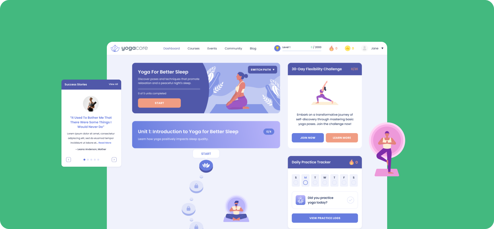
- Progress Tracking: Show Users How Far They’ve Come (Don't Let Them Get Lost in the Woods!)
People stay engaged when they see their own progress. MSFS 2024’s Career Mode shows you exactly what’s ahead and what you’ve already accomplished. Seeing progress releases dopamine, the 'feel-good' chemical. It's like crossing items off a to-do list. We're wired to crave that sense of accomplishment.
Think of it like hiking a mountain. You want to see how far you've climbed and how much further you have to go.
Yoga Core Case Study:
- Visual Progress Bars: Within each path (e.g., "Inner Peace Yoga"), show a clear progress bar for each module and the entire path.
- Lesson Completion Indicators: Mark lessons as complete with a checkmark or a celebratory animation (e.g., a small firework effect).
- Path Completion Certificates: Upon completing a path, reward users with a downloadable certificate or badge to celebrate their achievement.
How to apply this:
- Add visual progress tracking to courses.
- Show users a completion percentage on their learning path.
- Give them small wins early (even something as simple as a “Lesson 1 Complete!” badge).
- Use visual metaphors. Think progress bars that look like mountains being climbed, or maps being filled in.
- Unlockable Content: Make Learning Feel Like Leveling Up (Reward the Grind!)
Games keep players engaged by unlocking new content as they progress. Instead of dumping everything on the player at once, they earn their way forward. This is the 'carrot' principle. It's about creating anticipation and rewarding effort. It taps into our natural curiosity and desire for mastery.
It's like a choose your own adventure book!
Yoga Core Case Study:
- Unlock New Modules: After completing a certain number of beginner modules in "Inner Peace Yoga," unlock access to intermediate routines or specialized meditation sessions.
- Exclusive Content: Reward members who consistently engage with challenges and complete modules by unlocking access to exclusive interviews with renowned yoga teachers or bonus content.
- Community Access: Restrict access to certain community areas or discussions until members reach a certain level of engagement or complete specific courses.
How to apply this:
- Lock some courses or challenges behind milestones.
- Give users a sense of progression (e.g., “Complete this module to unlock the next one”).
- Use streaks and achievements to reinforce consistent learning. For example, give a badge for completing the first module, another for completing the whole course, and a special badge for participating in a community challenge.
- Create themed unlockables. Maybe completing a specific module unlocks a "secret" bonus video or resource pack.
- Social Engagement: Encourage Interaction Through Challenges (Make It a Party, Not a Lecture!)
Great multiplayer games don’t just tell players to chat—they give them reasons to interact. Humans are social creatures. We want to connect, collaborate, and feel like we belong. Challenges give us a shared goal and a reason to interact.
It’s like joining a sports team versus just going to the gym alone. The team gives you accountability, camaraderie, and a shared purpose.
Yoga Core Case Study:
- Monthly Group Challenges: Organize monthly themed challenges (e.g., "30-Day Flexibility Challenge") where members complete specific routines together and share their progress.
- Partner Yoga Sessions: Encourage members to find workout buddies within the community and complete partner yoga routines together, sharing photos and videos of their sessions.
- Community Q&A Sessions: Host live Q&A sessions with expert instructors, inviting members to submit questions and engage in discussions around specific yoga techniques or topics.
How to apply this:
- Introduce challenges or group missions (e.g., “Complete this course with a group by the end of the month!”).
- Reward collaborative learning (badges, shoutouts, or leaderboard positions for engagement).
- Add gamified discussions (e.g., unlock discussion topics as lessons progress). For example, create a leaderboard for the number of lessons completed in a week, or for the number of helpful posts in the forum.
- Don’t just create challenges, create stories around them. Maybe a monthly theme based on a specific myth or legend, or a challenge tied to a real-world event.
I've tried the 'slap a leaderboard on it' approach. I thought it would be easy. I was wrong. It just made my site look tacky. Leaderboards without context? Useless. Streaks without rewards? Pointless. We need to be smarter than that. Gamification is about understanding human psychology, not just adding shiny objects.
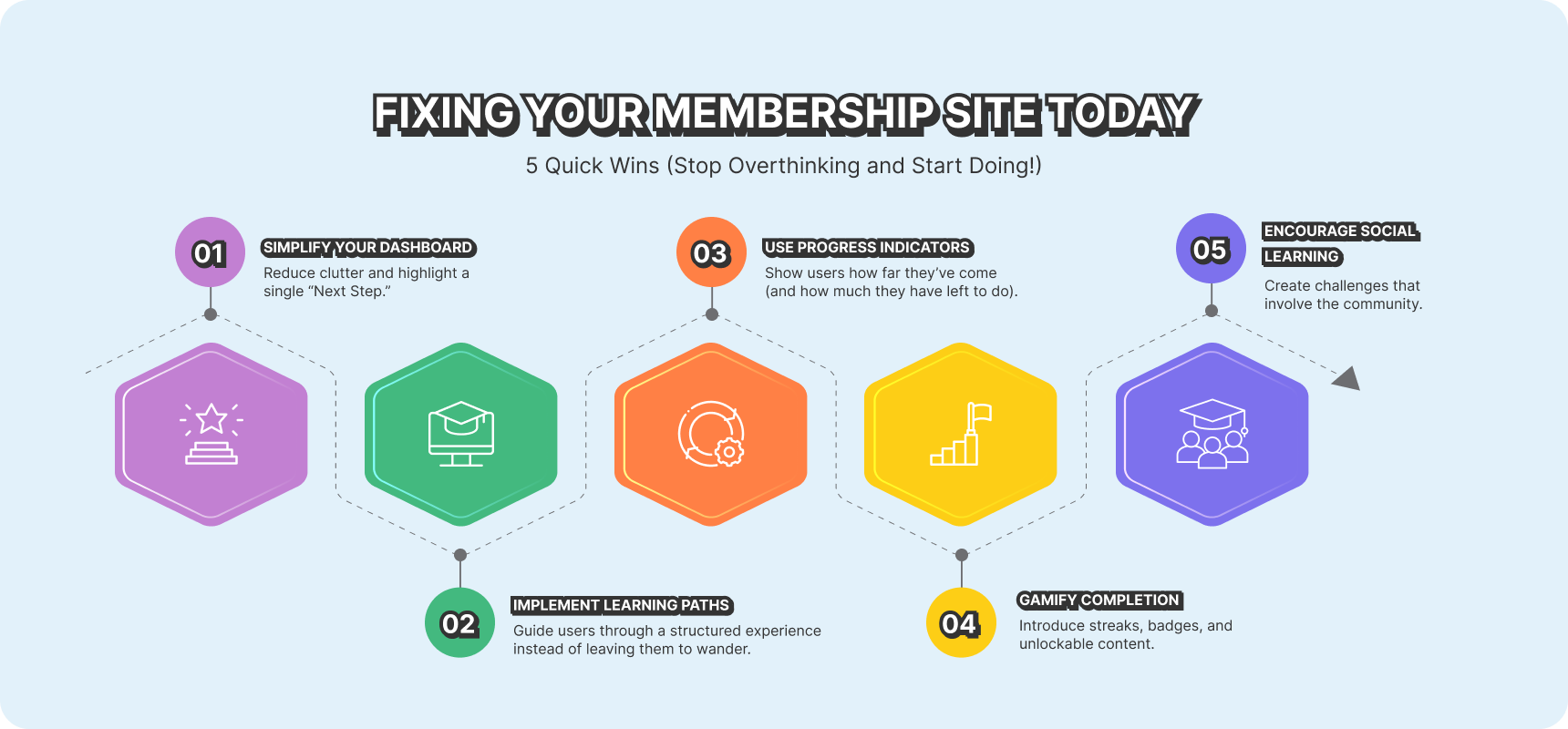
Fixing Your Membership Site Today: 5 Quick Wins (Stop Overthinking and Start Doing!)
- Simplify Your Dashboard – Reduce clutter and highlight a single “Next Step.”
- Implement Learning Paths – Guide users through a structured experience instead of leaving them to wander.
- Use Progress Indicators – Show users how far they’ve come (and how much they have left to do).
- Gamify Completion – Introduce streaks, badges, and unlockable content.
- Encourage Social Learning – Create challenges that involve the community.
Your users are bombarded with dopamine hits all day long. You need to give them a reason to choose your site over the endless scroll. You need to make learning fun. Think of it as competing for attention. Not in a bad way, but in a way that provides better value than the other distractions.
I know you're busy, but this is important. Take 15 minutes right now and look at your dashboard. What's the first thing you see? Is it clear? Is it inviting? Or is it overwhelming? Don't just read this and forget about it. Take one small step today. Even just simplifying your dashboard can make a huge difference.
Pick one of the 'Quick Wins' and implement it today.
And if your membership site feels overwhelming, let’s chat—PB Digital specializes in turning ghost towns into thriving communities.
Recommended for you


Tell us about your project
We’d love to talk about your web project. Please let us know a bit about your project and we’ll be back in touch soon.